FYI


Friday, March 12, 2010

From Ugly Mug to High-Profile Mug

In one of my former lives I used to work for a large internet company, popularly associated with the colour purple. Guess who it was? Yahoo! You've got it... One of the superficial little perks of working for a large American corporation such as Yahoo! was the bits of merchandising that were continually thrown our way. I haven't really counted, but during my 3,5 year stint there, I came away with two jackets, about eight T-Shirts, two bags, two USB-computer lights, several baseball caps, a desk clock, other miscellaneous stuff and three mugs. Now that I am no longer associated with my former employer, I might as well pretty up those mugs.


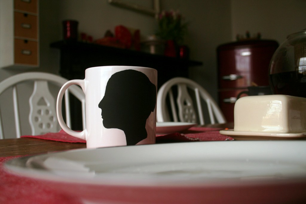
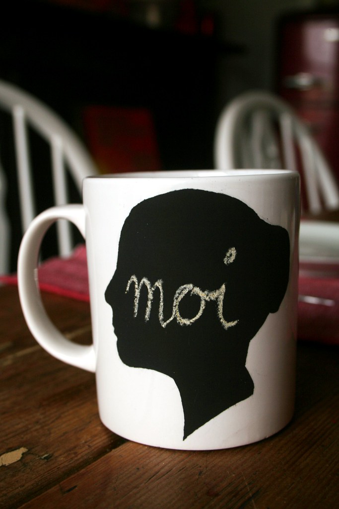
One of my favourite crafty helpers is blackboard spray. In the past I have created blackboard labels on storage tins and on jam jar lids, a sweet little blackboard and my memory pebble. Then the other day I came across this great re-vamp via the link party at A Soft Place to Land. Jennifer Juniper at Hope Studios used blackboard paint to paint over the logo-ed mugs and create a writable blackboard label on them. I loved the idea - and have adapted it with my own little twist: A blackboard label in the shape of a classic, black silhouette.

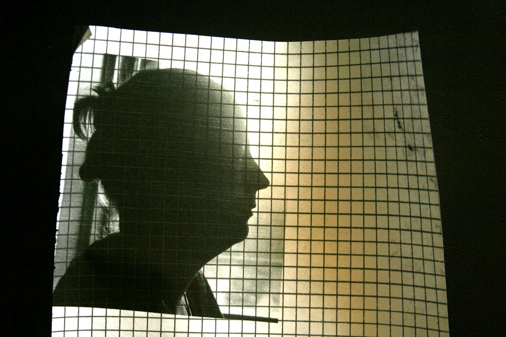
Here is how I did it: First of all I printed a photo of myself in profile onto the back of a peelable, clear sticky film. (What do you call that stuff - you know, that film you can cover books in...). Make sure your silhouette is big enough to cover the logo on your mug! Also, unlike my illustration left, make sure you have enough space around the edges of the profile! (I forgot to take a pic of the second attempt at printing it on the film...)

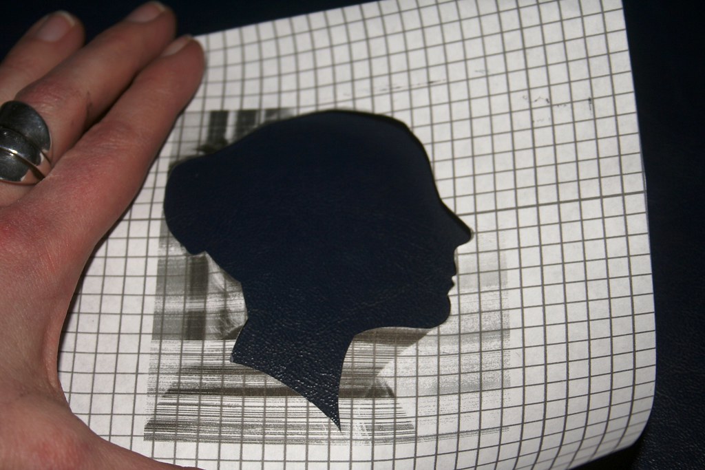
Then I cut out my profile. This is a bit tricky - use nail scissors so you can negotiate the delicate line of the profile. Start by cutting a little slit in the middle of the "head" and then cut outwards to the profile line and cut out the shape. (*ahem* I prettied myself up a bit there, getting rid of my double chin...) Discard the middle bit and you are left with the template.

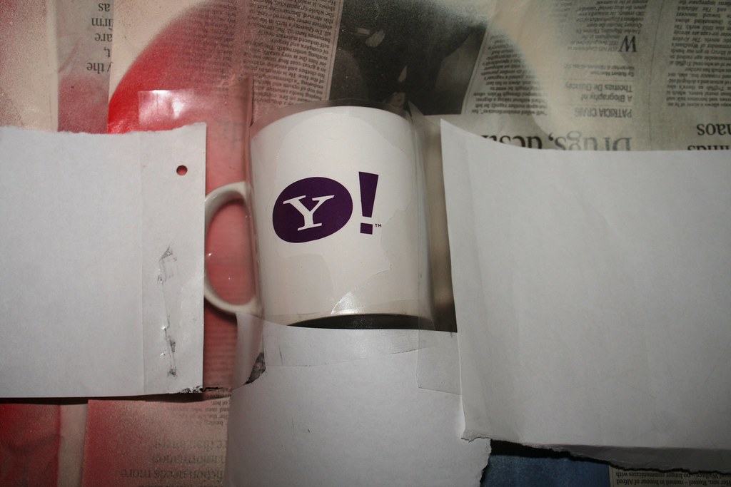
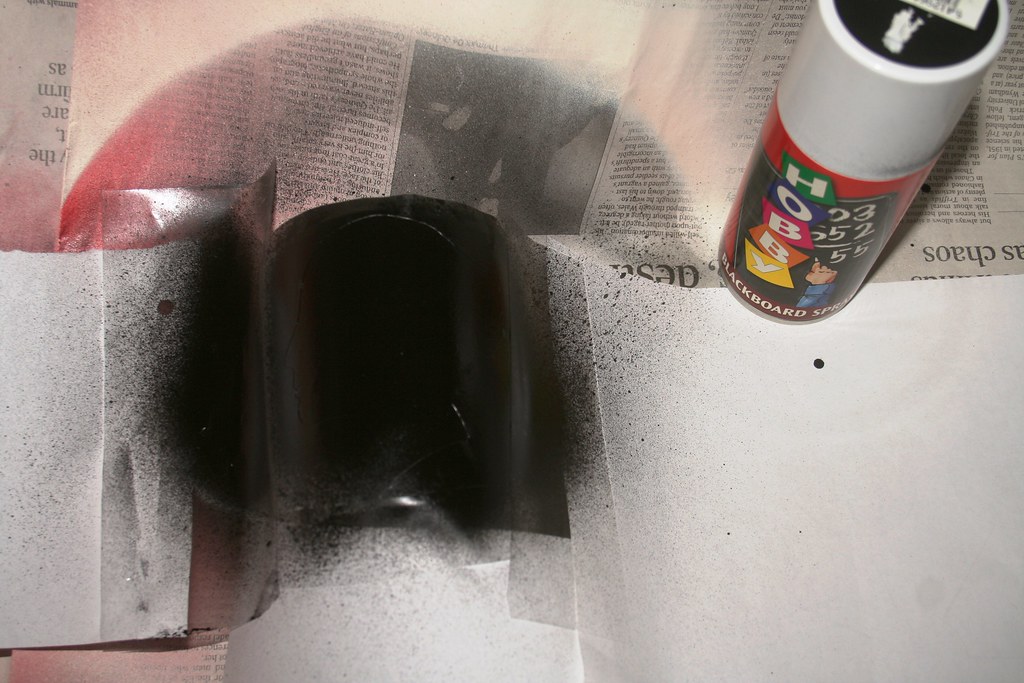
Peel off the backing paper and place your template on the mug. Make sure it covers up the logo completely - you do not want to have a big purple exclamation mark to peek out next to your profile... Push along the edges of the film with your fingernail so no paint bleeds under it. Cover the rest of the mug with paper so you don't get any paint drops anywhere else.


Now spray over the template. You should give it at least two coats of paint, to make sure you have covered it completely. Let it dry for at least half an hour in between coats (or whatever your brand of blackboard spray recommends).


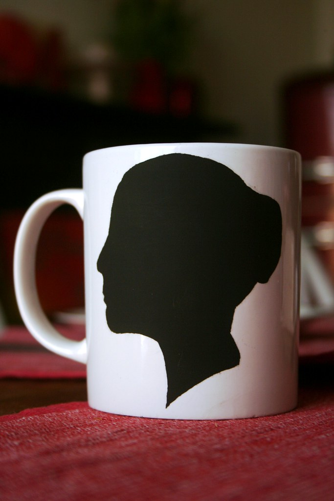
After drying, carefully peel off the sticky film. And you are done! Chances are, that the spray paint has bled a little bit under the film. No panic - take a craft knife and slowly and carefully scratch off any bumpy bits from your silhouette - you don't want to end up with a blobby big wart on your elegant nose *hehe*.

What do you think? Hm, it may seem a little bit egocentric to have a mug with your own pretty "mug" (Irish slang for "face" *hehe*) on it. So make a few more for all the family members. Write a little witty slogan on it and personalise your breakfast table ;-)


Now, I have no idea how well these fare in the dishwasher. I suspect it may rub off in there. So this might be a precious mug for those special occasions. Ah well, form cannot always follow function. Nonetheless, they are an improvement from an advertising gizmo to a personal piece of crockery!


Best,


Linking to 


DIY Day @ ASPTL


Monday, March 8, 2010

Charity Cake Stand

Right, I promised that I wouldn't turn this into a photography blog - and here is the proof: My latest project. Last week I went into a few charity shops, just checking if there was anything cheap and cheerful there to transform. I came home with a little candleholder that I snapped up for € 1. I knew I was going to try and turn it into a cake stand, so I hunted for an old plate in our garden (which is where a lot of our stuff ends up - in the kids' garden house). The result is this little, romantic beauty:


Here is how I started out:

1. I cleaned the plate and candleholder thoroughly.

2. Then I gave them both a coat of red spray paint. 

3. While out, charity-shop hunting, I also picked up a can of crickle paint. I always wanted to try that out - and here was the opportunity. So I applied a coat of crickle paint on the dried red spray paint. And the crickle stuff did what it said on the tin - it started crickling pretty much straight away. 

4. I applied a coat of matt spray varnish to the plate and candlestick - just in case... 

5. Lastly I used some silicone glue to stick the plate to the candlestick.


That was it - a rather romantic, shabby chic cake stand. I don't know, pink doesn't really feature in my decor very much, so I was not quite that happy with the outcome. If you use crickle spray, keep in mind that the cracks will show the colour you applied underneath the crickle spray - in my case red. Ah well... What do you think?


Best,


Linking to 

Make it Yours @ My Backyard Eden


DIY Day @ ASPTL


Cool Collages

Can you read this:


Yay - Craft-Werk!!! If I didn't already have a banner that I am quite happy with, this is what I would use. If you look closely you can see that the images in the collage are all the projects I have presented here on the blog since I started nine months ago (go on, take out that magnifying glass, I dare ya!)

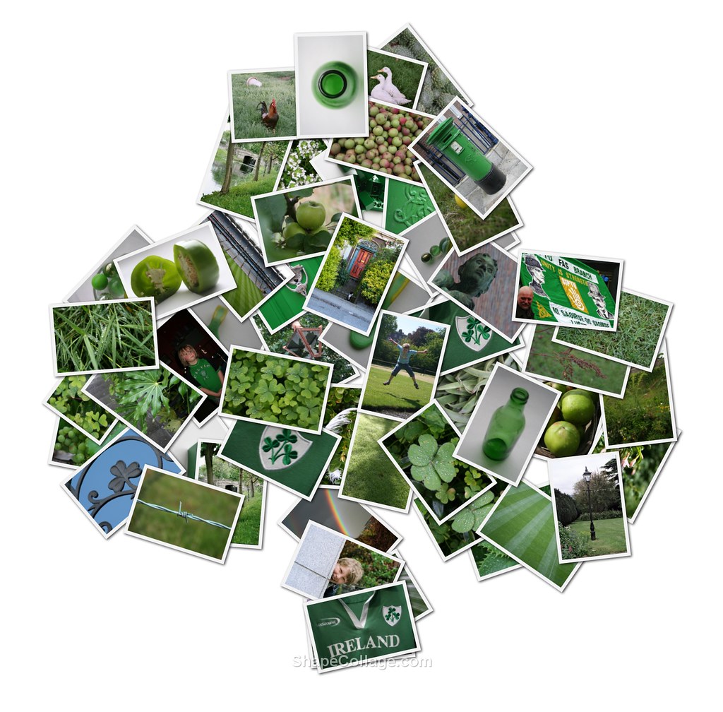
Yep, I have turned into a geek, I know. But it's just so easy to do, I couldn't resist. And while I was at it, I finally also got into the swing and turned all my green photos into a collage for St. Patrick's Day.Strictly speaking it is not created by me - but I thought I'd show you my find because you might want to create a nice little collage for Paddy's Day or any other upcoming event in your busy lives...


No, I did not painstakingly print and cut out every photo and stick it in a shamrock shape - Shape Collage did that for me. It's really cool - you download their application for free, then you drag and drop all your chosen image into the tool, determine the shape you want it arranged in and click "create". Bang, there it is. There are tons of shapes to choose from - or you can (freehand) draw your own shape. I love it - photo collages made easy. Give it a shot...

Best,

PS: Ok, yes, I promise this is not turning into a photography blog. This will - probably - be the last photo post in a while. And: I am not getting paid to promote this site... unfortunately!

Shout Out: Someday Crafts

Chances are you already know Michelle's brilliant and several times daily-updated blog Someday Crafts!?

 
Well, if you don't, now is the time to check her site out. I love it - there are beautiful, practical, easy, inspiring craft projects on her site every day. And today I am getting a mention with my bottle bottoms creations. Remember them? I cut off the bottoms of old fizzy drinks bottles and made flower decorations from them. I still have a few unfinished ones lying around on my desk, and tonight they came in very handy as bead trays while I was making some of my bead ball objects. So versatile *haha*...
Anyway, go on over there and leave her a comment - tell her I said hi ;-)...
I have a couple of projects in the pipeline here. I am working on a charity shop find... Not really sure whether I like the outcome, but I will show it in due course. Meanwhile I have also (re-)activated my etsy shop. If you scroll down you can find the widget at the end of this blog page. - Etsy is dangerous, though - I have just shopped around there and ordered a few bits and pieces for crafting. Hehe, and then my Paypal somehow closed on me, and I couldn't go through with the second order... Well, maybe it is better this way.
Best,

Saturday, March 6, 2010

Photography Tips for Bloggers - Part 2

Geek Week continues. I am not done yet with photography tips, so here is part 2 of my do's and don'ts when it comes to taking pictures for your craft blog. In yesterday's post I suggested what you can do to get rid of unsightly shadows in your pictures, how to use flash correctly and explained why a calm and clean background is so important. If you missed the post, click here.

Today I want to look at other common mistakes. Let's jump right in...

4.    Take note of the minimum distance!
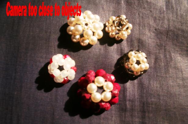
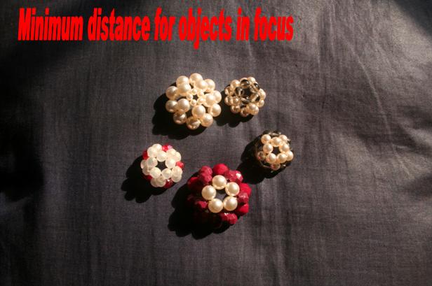
Many pictures I see in blogs are blurry close-ups, accompanied by a note “Sorry for the blur; I don’t know how that happened…”. I can tell you how: You probably came too close to your subject! Automatic cameras will snap anything that you point your camera at. However, all cameras have a specific minimum distance between the lens and the object which the camera is shooting. Moving closer than the suggested minimum distance will result in blurry images. 


I am shooting with a Canon 350 digital SLR. On the lens it tells me the minimum distance I can shoot an object from: 0.28m/0.9ft. What it means is – if I am any closer than 28cm/9 inches to my subject, the lens will not be able to focus on it clearly and the image will come out blurred. Check your camera for the telltale note – or look up your manual to find out.

5.    Frame the subject as big as you can!
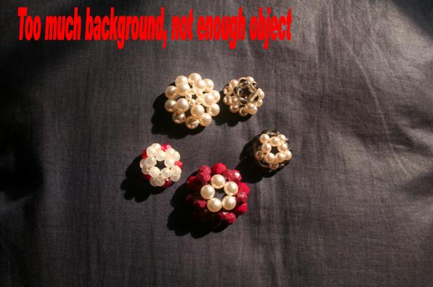
If you followed my advice from number 4, you will end up with a focussed picture that has your object in the centre - but a lot of unnecessary background around it. And again I am not happy - frame closer! This tip came from the camera manual of my first “proper” automatic camera, a Pentax. The advice is priceless: Whatever you are photographing, whether it is an object or a group of things – try to get them as big in the frame as you can. That way your readers can see the object clearly and in detail. Alternatively… (read on to number 6).    


6. Crop for best results!
Tip number 6 follows from tip 5: If you have taken a picture that has too much background showing, just crop it down closer to the object. For best effect, leave the same amount of space on opposite sides of the image. 


Compare the next two images:

 Isn't the second one more pleasing to the eye? Plus it gets more detail across to the viewer.

7.    Minimal PS-Intervention is fine!
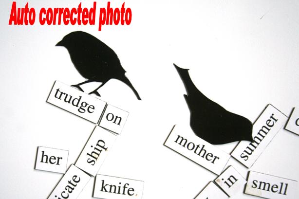
Let’s face it: We are crafters, not photographers. Your photo optimization should not take longer than the time it took to make your craft object. Bearing in mind that photos look pretty good on a computer screen even at low resolutions, there is not that much you need to do. For general purposes it is fine to use the “auto correct” button in MS Picture Manager or in online applications like Picnik. This will automatically set the exposure, colour and contrast on an assumed ideal level and usually takes out the dullness from pictures. I find that it is quicker to use auto correct in Picture Manager than to wait for Picnik to open up on Flickr. So I quickly auto correct my images on my laptop and then upload to the online album where I am hosting my images.
Here is an example where the auto correct chose a better white balance for my image:


This was just done with one click on the auto correct button! Yes, I do know that the pros use Photoshop - but to reiterate: This is photo optimisation for amateurs and not for geeks.

And finally an appeal:

Less is More!Please don’t overload your post with pictures. Concentrate on a few good shots for illustration. Pick out the ones that show your object clearly and attractively. No need to show every single shot which you took during your 3-hour-shoot. – Your readers just get bored having to scroll down your post over shot next to identical shot next to identical shot next to... Either they just scroll without looking properly and will miss the really good shots. Or if worse comes to worst, they get frustrated and jump blog ship mid-post. So keep it sweet - it also makes posting quicker for you!


Ok - sermon over! As you can see, I do not always adhere to my own rules. Of course I have pics on my blog which are washed out, badly composed, full of hard shadow or unnecessarily large background. You can't follow every photo rule religiously. But maybe my tips have made you more aware of the importance of good photography? Give the tips which you found interesting or helpful a shot - quite literally! I would love to hear about your experiences! And if you have any particular photo-related question, please drop me a comment or send me an e-mail.


Happy snapping, everyone!
 

Friday, March 5, 2010

Photography Tips for Bloggers

Photos play a big part in craft blogs on the net. We all want to display our beautiful creations or show how we made them. Illustrations also work like eyecatchers – posting one at the start of your blog post can attract your readers attention. Chances are that the split-second decision whether the visitors to your blog will read your post or not, is made based on the impression the first photo creates. Photo quality is crucial for that. And having looked at thousands of photos since I first entered Craft-Blogland, I have noticed a number of problems that come up again and again. As you all may have noticed, I am big into photography. Actually I am studying for a degree in photography in college at the moment.  And I thought that I might share some of my tips and ideas so you can improve your photography. I’ll illustrate my post with good and bad examples, so you can see my tips in action. So here’s for another “Babes in Geekland”-post... Sonja’s photography tips for dummies bloggers ;-)

1. Centre-stage your Objects!
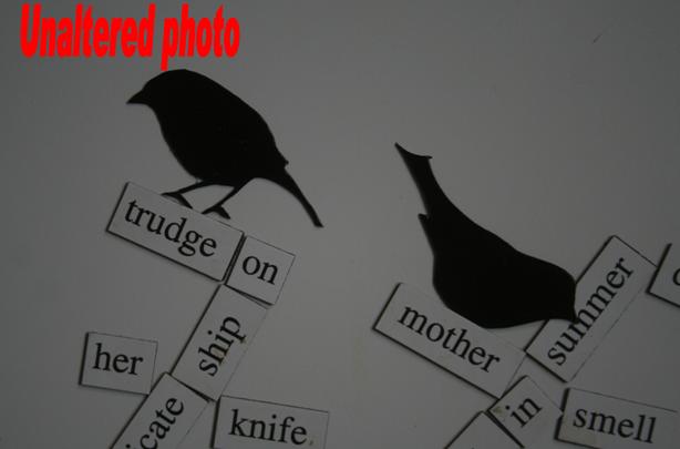
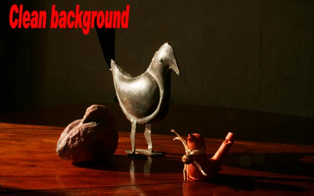
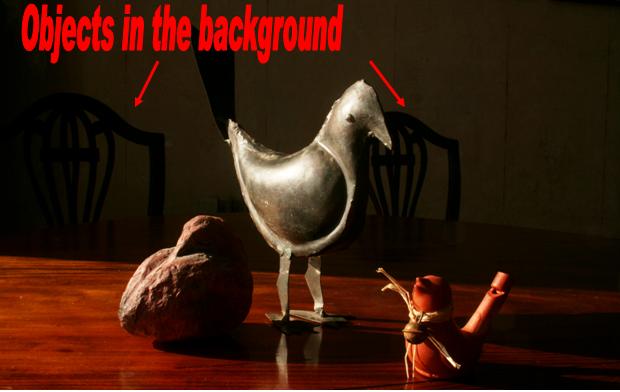
Whether you are taking a picture of your family or of an object – always make sure that nothing distracts from your subjects. So, when photographing something, arrange it nicely and clearly and make sure you have no other objects in the background that might protrude into the scene and distract from the overall image. You get best effects when your background is monochrome – or simply one colour. That way your viewers’ eyes will concentrate on the object in the foreground and their gaze is not distracted by anything else. So set up your object in front of a white wall – or place a piece of board or a sheet behind your object to hide busy and distracting backgrounds.

My example shots are quite subtle, but in picture one you can see some chairs left in the background. Compare with the clean background of shot 2. Which one is more pleasing to the eye when nothing has been changed but the background?

2. Get rid of Shadows!
Try to avoid using flash if you can – either by moving your object near natural light (i.e. window sill) or by scheduling your shoot for daylight hours.
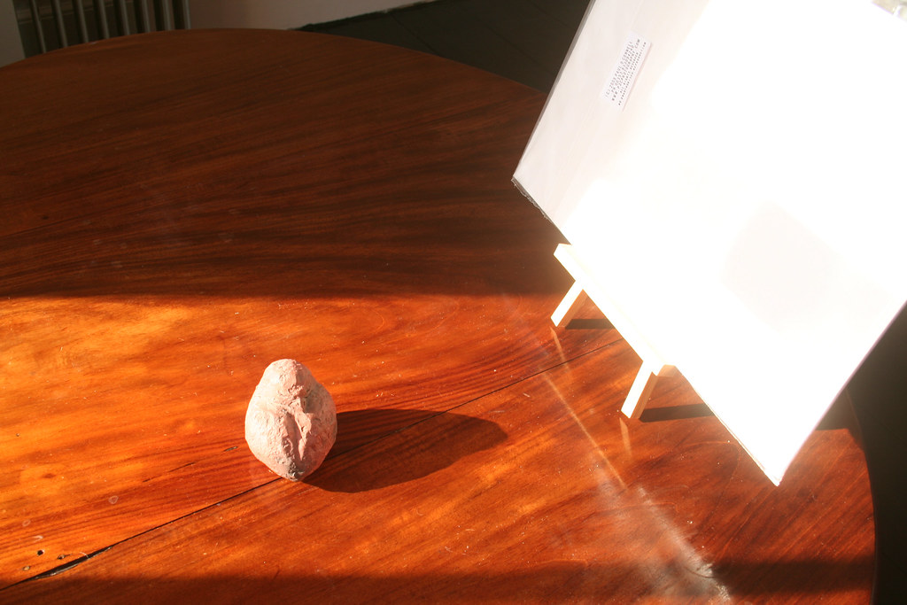
Even daylight will create shadows, but you can even cancel that out by placing a piece of white cardboard or other reflective surface next to your object, but keeping it out of your frame.

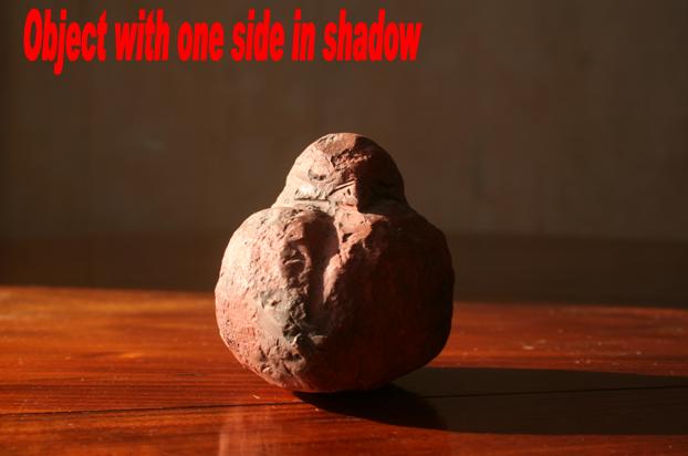
Here is a little birdy which I have shot in the direct sunlight. The effect is actually not that bad, but I have lost some of the bird's detail because the harsh shadow obscures the pretty head. For the second picture I placed white cardboard beside the bird and thus lightened up the shadows.


I have not used any additional lighting, this is the pure sunlight reflected back!!! This is the set-up:

3. Diffuse or Bounce your Flash Light!
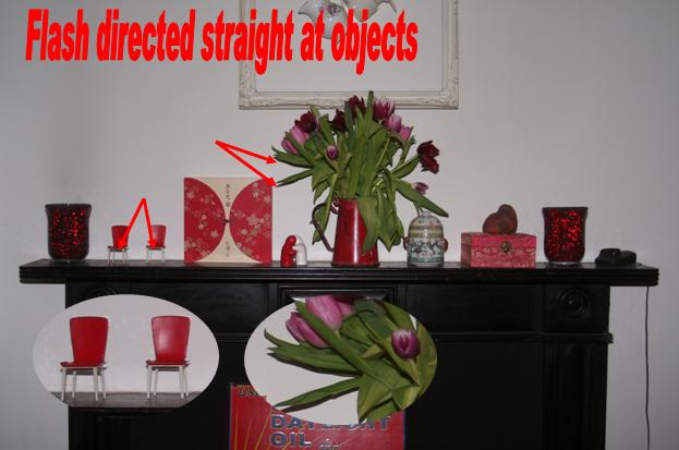
As most of our crafty stuff is indoor decorations, we mostly shoot inside. Depending on the amount of light in your room, the camera will automatically fire its flash to illuminate the subject. The result is unsightly hard shadow of the object against the background. Sometimes the shadow obscures other details in the shot, other times it creates reflections and highlights that distract from the overall image. If you must shoot with flash, there are a couple of tricks that the professionals use:
You can make the shadows softer by diffusing the light that fires from your flash. Simply stick a bit of translucent scotch tape over it. It softens the edges of the shadow but will probably still give enough light to illuminate your scene.

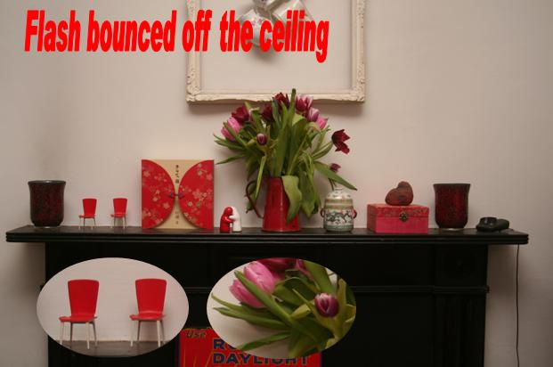
If you are using a separate flash, direct the flash to the ceiling. The theory is thus: Light travels in straight lines. If you point your camera straight onto the object but the flashlight against the ceiling, the light will bounce off the ceiling first, loose some of its brightness and illuminate the scene from above. The shadows will not fall against the background, but more against the surface your object is placed on. Due to the loss in brightness the shadows will also appear softer. As an overall effect the shadows will not be so apparent and will neither distract from nor obscure the object.

In my example, the flash light creates hard shadow against the wall. The light is rather blueish-cold. Check the insets for the details and compare with the second shot, taken with flashlight bounced off the ceiling.
 

Can you see how the light appears softer, warmer and the shadows have almost completely gone?

Come back tomorrow for another series of tips on how to improve your photos!

Best,

Thursday, March 4, 2010

Keep-calm-o-mania continues...

I can't get enough of the KEEP CALM AND... posters. They are just so cute. And my blog improvement drive is continuing, too. So I have just added another button to Craft-Werk. 

tried and tested


This one is for those of you, whose links, ideas, crafts or posts I have mentioned on my blog. Please, if you find that I have given you a little shout-out here, grab the button and show it on your blog. 

On the topic of showing other crafters' work: I hope you all notice that I do try to give credit whenever I take inspiration from other crafters, use their ideas or re-create what they have done. However, I generally do not use any photos or illustrations from other crafters. The reason for that is that I am a bit anal about copyrights. Strictly speaking, the rights to the photos always lie with the creator. I totally do not mind my pictures being used on other people's blogs - heck, I don't even watermark mine to show my copyright. But I am very careful about importing other people's creative property. Part of it is actually laziness, though - in order to get permission to use third party images I would have to get in touch with you and ask. Too much trouble. 

I do appreciate it, however, if people let me know that they would like me to show off a creation of theirs. For that purpose, just leave me a comment or send an e-mail to craftwerk(at)ymail(dot)com and I will see what I can do.
Happy blogging, everyone,
 

Tuesday, March 2, 2010

Keep calm - Craft-Werk is still around

I am increasingly busy with my college work, so not much time for crafting at the mo :-(. Proposals are waiting to be written up, studio work needs organising, ideas and concepts have to be developed. My creative energy is channelled into photography at the moment. But I couldn't resist a cute little link that I saw on Yasemine's blog Love live survive home today. 
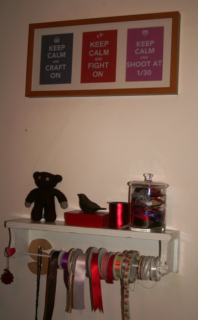
You all know those "KEEP CALM AND CARRY ON" posters. Don't we all want to have one of those on our walls? Well, now you can print one of those out yourself - and even customize it with your own slogan - for free, of course. Just go to keepcalm-o-matic and they will do the rest for you. You can choose slogan, background colour, font and even the little image at the top. Punch it all in, click generate and you have it downloadable in jpg format. As a craftress, I had to generate this one:


Did I mention I am mad about photography?


Arrrrgh, disclaimer: Upon viewing my post I just realized that the above slogan looks like a call to arms, i.e. let's shoot someone on January 30th... noooooooooooooo!!!!!!!!!!! For the photography-uninitiated: "shooting" is photographing and 1/30 is not a date but the shutter speed of 1/30th of a second... *phew* had to make that clear...

Anyway, once I had generated and saved them, I knew that I couldn't just leave them sitting on my hard-drive. They had to be displayed. Out came an old frame from the big stash. Problem: there were three spaces for images in the mount, so I had to come up with another slogan from the Ministry of Propaganda. Besides crafting and photography my other big interest is politics, so I made another slogan. As the generator only has a limited number of symbols, none of them fitted my own slogan. So I simply recreated the poster in MS Word, using Wingdings for the symbol. It took about 20 print outs to get the sizing and font vaguely alright - I have a whole heap of discarded posters on my desk now - maybe I should go out and start papering lampposts with my messages... But I did eventually get it right and now have my slogans on the wall above my desk. 

I love it - I keep glancing up there to enjoy the retro-feeling and the messages that are close to my heart.
So, go on and make some for yourself. Here is the final message from the Ministry of Propaganda:


Best,